


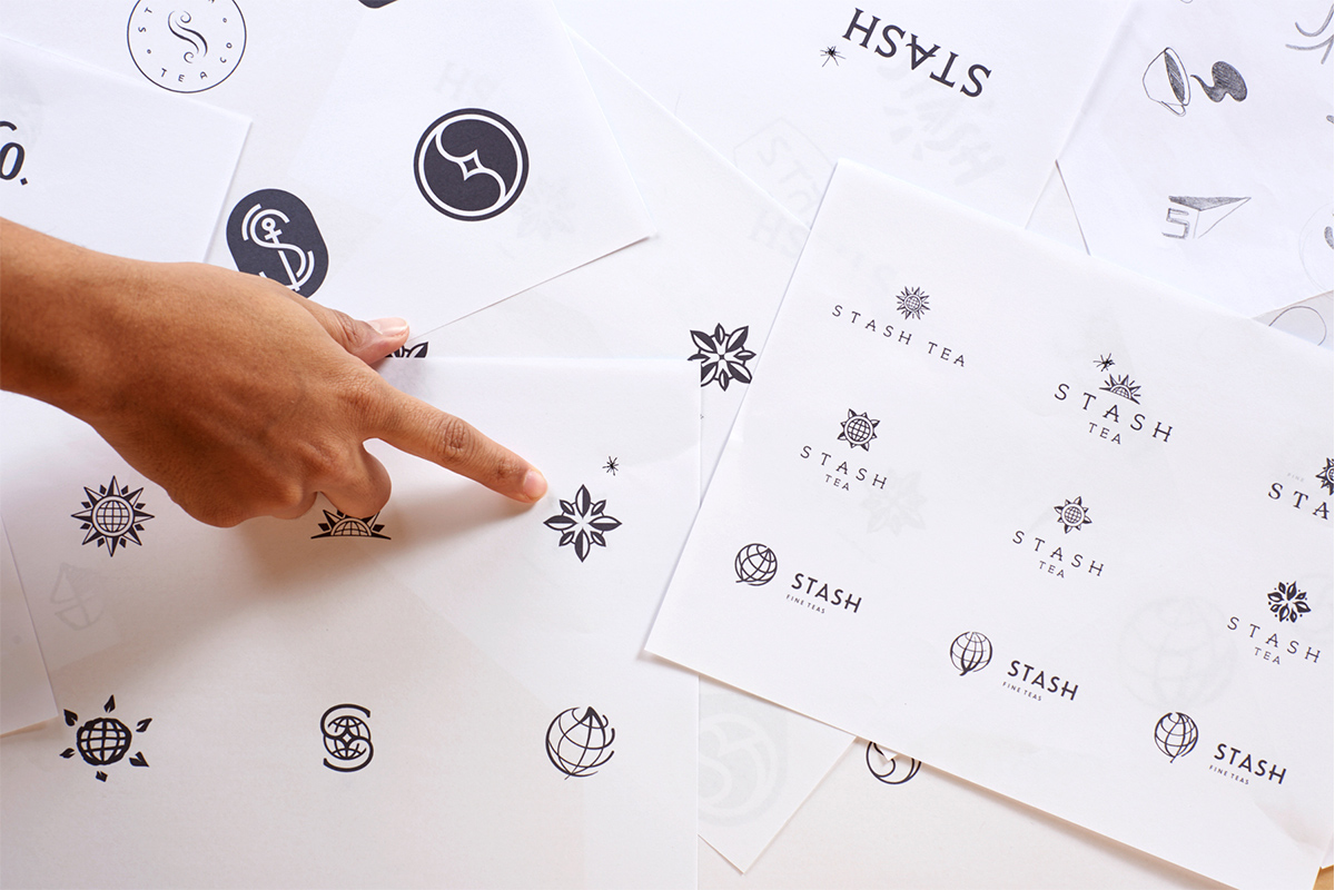
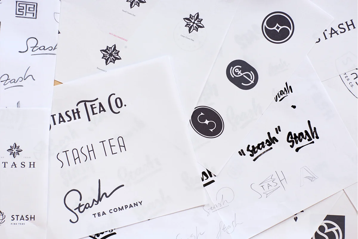
STASH TEA REBRAND & PACKAGING
Stash Tea has been a household name for over 30 years and was in need of a brand refresh. Stash came to Jolby & Friends to redefine their brand in a way that would reposition them with their avid customer base and attract new tea drinkers alike. We started with what was at the core of the brand already: a bold mark, bright colors, and a focus on their quality and natural ingredients. Over a year’s worth of research, designing, testing, and launching led us here.
This was created at Jolby & Friends Studio


INGREDIENT PHOTOGRAPHY & THE STACK
The new approach for brand photography was defined to use fresh ingredients playfully stacked on top of each other called “The Stack”. The Stack was designed as a unique way to represent flavor and Stash’s light-hearted personality in one photo asset. The Stack defies gravity and proportions in a playful way and uses props to help show the flavor of the tea inside.


RESPONSIVE TYPE
Each box has a container on it for the type of tea, the name, and a short flavor description. Our challenge was fitting in tea names from one word to as many as eight, as well as short English words and long French names. The system we designed is responsive with each box and orientation.
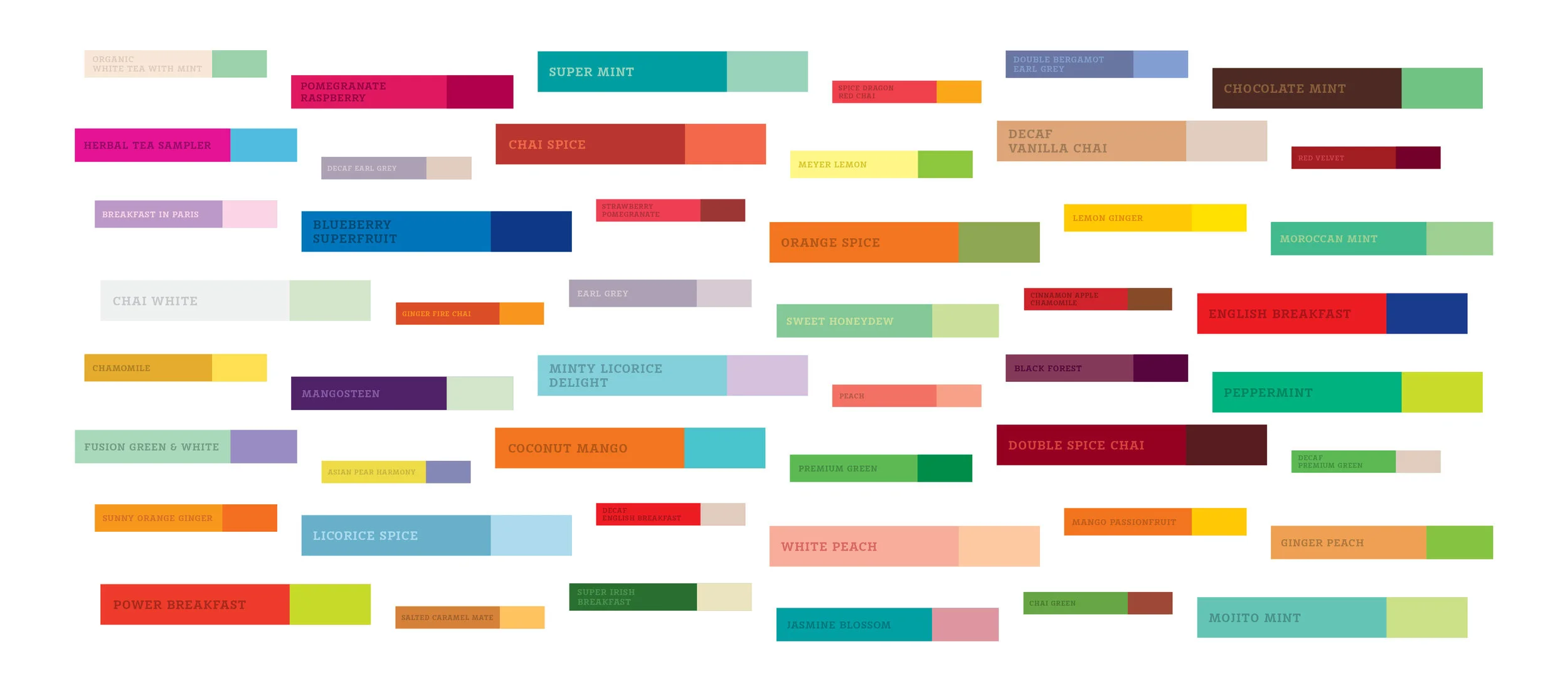
THE COLOR SYSTEM
Stash’s previous flavors were defined by a single color that limited how new teas would be added to their ever-growing catalog. Our solution was to introduce a two-color system to broaden the brand’s color palette and to define flavors via color combinations. Each color pair acts as a visual for the taste of the tea and follows the flavor from its packaging to its envelope to its tea tag.
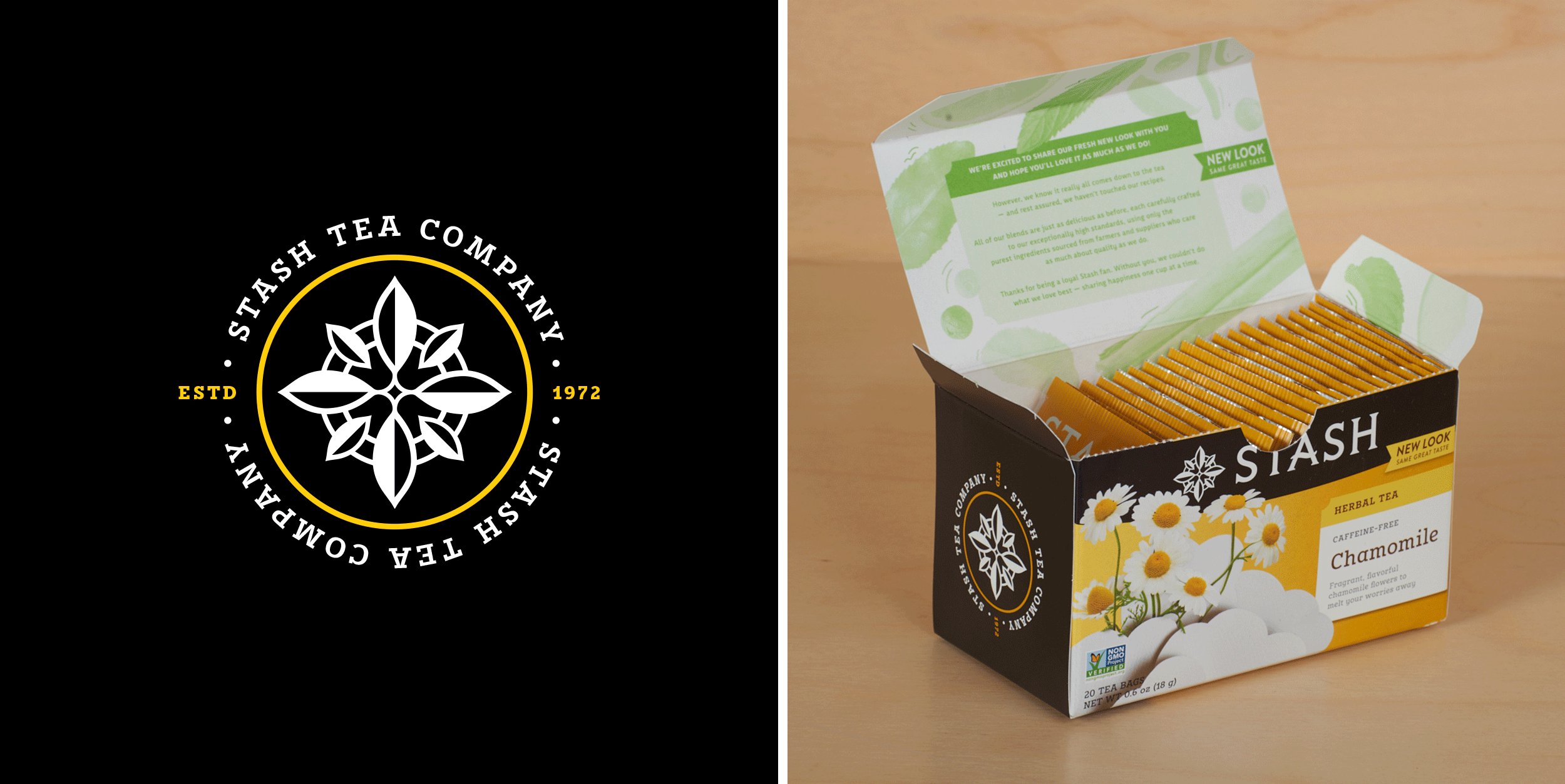
FINAL 200+ PACK DESIGNS
The packs themselves needed to have their own individual flavor identities while also feeling like a family. We did this through a consistent design foundation, stunning photography, bright and unique colors, and a design that makes you curious to keep twirling the box in your hands. The rebrand was launched with over 200 different packs, envelopes, tea tags, and more. Here's how it all came together!


THE ENVELOPE EXPERIENCE
The tea envelope itself is one of those important parts of the tea experience. Most tea envelopes are separated from their box counterparts and appear on their own, making each tea envelope a brand ambassador. Each flavor’s color pairing shines on the envelopes. Bold, full color floods are used to easily identify your favorite tea in a pinch.


Project Details
Client: Stash Tea Company
Created in 2018 at Jolby & Friends